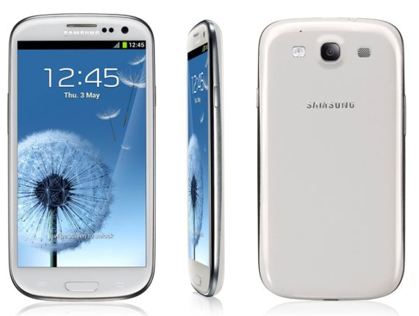
Samsung Galaxy S3 Impressions and Review
I have one of these Galaxy S3 things now. The phone is a technological marvel and is honestly one of the greatest pieces of Android kit I’ve used and I’ve gone through:
- Google G1
- HTC Hero
- HTC Desire
- Motorola Atrix
The Great

The OK
- Battery life, despite having a 2100mAh battery, is still at around a day or so. You’ll have to carry a charger with you.
- Charges slowly off USB – if you want to inject serious juice, you’ll need an AC socket.
- Compatible with third-party ‘iPhone’ hands-free kits. The volume controls don’t work, but the mic does, meaning you can take calls while the phone’s in your pocket.
- Some nifty tweaks to the default behaviour like being able to lift the phone to your ear to call someone from an SMS page without needing to navigate menus to do so
- “S Voice” – Samsung’s answer to Siri uses the same ‘beep’ noise and is OK, I guess. AIVC is infinitely better and has a sense of humour.
- Samsung apps are about what you’d expect from manufacturer-bundled apps.
Now that we’ve dealt with the great points of the phone, it’s time to talk about the UI.

However, there are some glaring horrible *built-in *flaws. It’s these that I want to talk about because I’m seriously pissed off with Samsung for reinventing the wheel and making it square. I’ll quickly list them here in handy bullet format.
The ‘*what the fuck?*‘

This bears explaining.
When Google released Android 4.0, the ability to pull icons from the drawer and drop them on the home screen got revamped. Now, not only were you able to drag and drop icons to your home screen, but if you dropped icons on top of one another, they will form a ‘stack’ or a folder. You could thus easily group your Google apps into one stack, your social apps into another, and your games into yet another, cutting down the amount of home screen clutter, while retaining the accessibility of shortcuts.
This feature is absent from TouchWiz. Samsung actually removed it and replaced it with the ability to create *folders. *To do this, you have to specifically create folders on your desktop before populating them. This wouldn’t be so bad if the icons didn’t look like sin and didn’t require you to name them or you’d be stuck with “Untitled Folder”.

I honestly don’t understand Samsung’s UI choices here. In the days of Android 1.x and 2.x, this was a necessary evil as the stock Google UI wasn’t terribly well-developed and handset manufacturers usually out-did Google. See HTC’s SenseUI for a great example of good UI design in the Android 2.x days. These days, with Google really picking up the slack and putting some hardcore development hours into their user interfaces, there’s really no need to re-design anything, other than maybe tweak the colours and theme of the default UI a little. Certainly not to the point where you’re actually going backwards in terms of functionality.
In my next post I’ll detail how to get around all these limitations in the space of 20 minutes and make your Galaxy S3 really shine and unleash its true potential, because, despite all my grumblings, this phone is great!